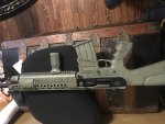
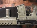
I like lighter shades because everything darkens up in the shade, and because lighter shades are easier to cover.
For areas where green foliage is present, I like base coat of something like
sage green.
Camo details/splotches should be darker.
After doing some shallow research into color theory for painting military aircraft and armor models, the idea that camo colors are mostly grays with tints came across as a core concept.
Again, I choose to work with a lighter palette, since everything looks darker when it dries, and lighting tends to make colors look darker in shaded light conditions. When mixing one's colors, this is most easily accomplished by simply mixing in some white.
Also, lighting can make a single color appear as two with a contrast line between. For example, a rifle barrel will appear lighter on top and darker on its bottom. The net result is a straight line that stands out where nature abhors a straight line.
This can be remedied by mixing a
very small amount of white into a flat clear coat and drybrushing/spraying the lower painted surface with it to achieve a slightly lighter tint on the bottom.
When we recently had siding put onto our home, the field color is a buttery cream color, with a light sage for the trim. The roof was done with dark green architectural shingles. The interior is being repainted in Southwest style light sandstone variations, and pecan shade woodwork.
Celia comes up with essentially all the colors.
Although we use color matching technology to bring different elements together (like paint for the garage T1-11 board, Decksaver coating for the rear deck, and the home's vinyl siding), the alternate colors (like the mailbox) are chosen to complement, and not to match.
Greg