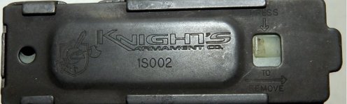
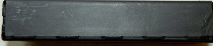
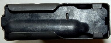
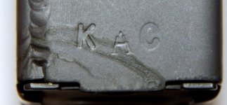
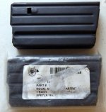
Would prefer to have at least one pic of the whole thing too. The closeups don't give the full picture.
That "A" in KAC is odd - never seen mismatched font like that. All of mine from that era have a matching font for all 3 letters. That doesn't mean yours is a knockoff though - they did all sorts of oddball stuff in Vero back in the day to keep production moving. Hard to say, would need some more pics. And ideally someone who knows the old stuff a little better than I do.