• The Shot You’ll Never Forget Giveaway - Enter To Win A Barrel From Rifle Barrel Blanks!

    Tell us about the best or most memorable shot you’ve ever taken. Contest ends June 13th and remember: subscribe for a better chance of winning!

    Join contest Subscribe

Need some input on some designs.

RWSGunsmithing

Gunny Sergeant
Commercial Supporter
Full Member
Minuteman
  • Mar 26, 2006
    5,008
    293
    Manning, Iowa
    www.rwsgunsmithing.com
    Well I'm not much for designing so I asked a gouldmafia (a fellow hide member) to come up with some ideas. Well in no time flat he had sent me several designs. I'm not much for designing so I need some help from the hide on what design to go with and if you have any suggestions please feel free to say something. Now these are for t-shirts and sweat shirts so please keep that in mind and I want it to be something that you would want to wear all the time.

    RW_25.jpg


    RWplain.jpg


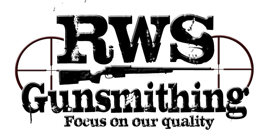
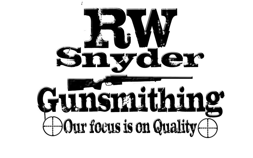
    This one I would like to have the RWS all one size but everything else would stay.

    rSw.jpg


    rwnewcopy1.jpg


    The one below this text is my signature.
     
    Re: Need some input on some designs.

    My 2 cents: I like 2nd or 3rd. I had to work to see the "W" in the first one. Last one is very blah and seems to put more focus on shooting then your gunsmithing.
     
    Re: Need some input on some designs.

    I thought that looked familiar. I still think the others are better looking and the one in you sig doesn't make me think of gunsmithing.
     
    Re: Need some input on some designs.

    I like the concept but not crazy about the font. Looks to much like Old Western saloon writing. Go a little more modern! I like the last one, the darker one. Font should be a brighter color, hard to catch up on at first.
     
    Re: Need some input on some designs.

    <div class="ubbcode-block"><div class="ubbcode-header">Originally Posted By: KYS338</div><div class="ubbcode-body">I like the concept but not crazy about the font. Looks to much like Old Western saloon writing. Go a little more modern! I like the last one, the darker one. Font should be a brighter color, hard to catch up on at first. </div></div>


    +1, although I think you could go a little cleaner in your concept. IMHO, I would want to keep your brand identity in mind. By that I mean having 6 different marks/logos can sometimes be confusing to the consumer. When someone sees your brand you want that to stick, usually having multiple identities can confuse people. Plus it just looks more professional. But that's just my .2
    grin.gif


    check out www.logopond.com for some direction/ideas.

    Chris
     
    Re: Need some input on some designs.

    Of those choices, I think #4 would be the winner; provided it was on a different background. It kind of blends into the black background and makes it hard to distinguish what you're seeing.

    I also think something a little simpler and more elegant would be a lot more recognizable, without really having to read what you're looking at.
     
    Re: Need some input on some designs.

    <div class="ubbcode-block"><div class="ubbcode-header">Originally Posted By: cds7221</div><div class="ubbcode-body"> I would want to keep your brand identity in mind. By that I mean having 6 different marks/logos can sometimes be confusing to the consumer.
    Chris </div></div>

    I am with Chris in that to many logo's gets confusing...
    I made up something quick... this is something more along the lines that comes to my mind when I think of your company.


    1.png

     
    Re: Need some input on some designs.

    Of the 4, I like #2. Its clean and simple.

    Also, as the owner of a t-shirt business, #2 will be the least expensive to produce shirts out of. One color, two at the most if you want the white in the letters on a dark shirt.

    Also, since we also do embroidery, #2 is the one most ilkely to embroider well on a hat. The others, forget it. Too much small detail.
     
    Re: Need some input on some designs.

    <div class="ubbcode-block"><div class="ubbcode-header">Originally Posted By: SmokinAce</div><div class="ubbcode-body"><div class="ubbcode-block"><div class="ubbcode-header">Originally Posted By: cds7221</div><div class="ubbcode-body"> I would want to keep your brand identity in mind. By that I mean having 6 different marks/logos can sometimes be confusing to the consumer.
    Chris </div></div>

    I am with Chris in that to many logo's gets confusing...
    I made up something quick... this is something more along the lines that comes to my mind when I think of your company.


    1.png

    </div></div>


    Strong solid concept. I really like the direction you went with this. I think its something that would work across multiple types of media. Good solid work.

    Chris
     
    Re: Need some input on some designs.

    Re size the rifle in #3 & #4 so that it doesn't look like a miss aligned suppressor or "firing bullet" on the right and pull it back so that the but stock is "in" the duplex. Or better yet drop in a Mil Dot reticle.


    FFT

    Cheers,

    Doc

    Belay my last didn't read from the top.

    Cheers,

    Doc
     
    Re: Need some input on some designs.

    OK these are just different ones i've made, He is only going to choose one, there will be no more than one logo he uses as his own. So the whole more than one logo taking away from his brand does not apply here.
     
    Re: Need some input on some designs.

    ....Now these are for t-shirts and sweat shirts so please keep that in mind and I want it to be something that you would want to wear all the time.........


    gouldmafia,
    Not trying to step on toes. I just brought it up because of what I read. I thought this was something that he was just using on his shirts/sweat shirts and that for sake of brand identity he might want to remain consistent throughout all of his media (business cards, letterhead, webpage etc). That's what I meant by too many logos/marks can confuse consumers.

    Chris

     
    Re: Need some input on some designs.

    Lots of great ideas here guys!! I really do apreaciate it.

    When your talking about brand identity is there something specific that your thinking of when someone says my name and business?

    Gouldmafia is correct I will be only chooseing one to go on shirts/sweat shirts that I wear out and give away with custom builds so I want one that looks great, advertises my business but not make the person wearing it look like a walking bill board.

    I'll be editing my first post with new designs as they come in.

    SniperCJ- I'm thinking you'll be next on my contact list after I get a design nailed down.
     
    Re: Need some input on some designs.

    #3 clen professional and will look alot better on shirts!!

    Sometimes to much detail means a blob!!
     
    Re: Need some input on some designs.

    Vote here is for #3. Suggest you might want to rethink your "motto". It seems you are telling folks to "Focus on our Quality"...kind of sounds like you are trying to divert attention from something else that you don't want people to look at? Perhaps something like "Our focus is on Quality". Your motto should be positive and inviting...not telling people what they should be looking at. Just a few thoughts.
     
    Re: Need some input on some designs.

    No offense RWS, but every one you've posted is WAY to busy. A good design should convey a message. Your slogan says "Focus on our quality", but I can't focus on anything with everything that's going on. At a bare minimum, you should lose the reticles that bookend the logo. After that I would recommend changing out the font. That old west looking serif font looks very outdated. I would recommend a strong sanserif font. I would also strongly recommend you turn off the 'bevel and emboss' effect you have on the letters.

    Just my 2 cents.
     
    Re: Need some input on some designs.

    You are trying to brand yourself- The most important factors in order of importance are as follows:

    1. Distinguish yourself from your competition.

    2. Keep it clean (legible)

    3. Make sure your logo/brand will work across all communication types
    print/web/other intended media

    4. Make sure this new logotype will not look dated in 10 years-you don't want to have to redo this later

    5. This is just me, but I would avoid the usual iconography (cross hairs, rifles, snipers) this has been done to death. Perhaps instead look for iconography around the shop that are key to producing outstanding weapons (mill, calipers, dials) I am not a gunsmith but I know certain tools and their uses when I see them.

    You may want your core values/principles help guide your decisions such as quality, precision, materials, pride, punctuality. Here are some logos in the industry that I feel are working:

    Magpul-speaks to innovation (design and materials)
    Winchester Repeating Arms- rugged old American tradition
    Springfield Armory- innovative new American tradition. Home of the M1A
    Schmidt and Bender- clean and recognizable (this is only a font, circle, and a dot)
    GA Precision-clean precise, easily repeatable ie. consistent accuracy (despite cross hair)

    Hope this info is slightly useful....

     
    Re: Need some input on some designs.

    <div class="ubbcode-block"><div class="ubbcode-header">Originally Posted By: m14er</div><div class="ubbcode-body">3. Make sure your logo/brand will work across all communication types
    print/web/other intended media</div></div>

    This is what I was trying to convey. Its easy to design a logo that looks good in print, but it wont transfer into screen print and definately not into embroidery. If you know from the beginning that you will want these things make sure the logo translates.